After one of the most hectic years in all of modern medical history, most medical websites feel way too outdated. Most websites should be changed every few years. However, any healthcare website that hasn’t been updated since 2020 is well overdue for an overhaul.
Disagree? These fifteen websites rake in the daily dough. Check out the following websites to inspire your own redesign.
The 15 Best Healthcare Websites: Categories
- Best Doctor Website
- Best Doctor Blog
- Best Hospital Website
- Best Children’s Hospital Website
- Best Neurology Website
- Best Psychiatric Website
- Best Dental Website
- Best OB-GYN Website
- Best Orthopedic website
- Best Podiatry Website
- Best Veterinary Website
- Best Healthy Lifestyle Website
- Best Health Tech Website
- Best Doctor Search Website
- Best Telehealth Website
Did we miss a category? Know of an awesome website we should include? Reach out at blog@fyresite.com.
1) Best Doctor Website
Barrett Plastic Surgery
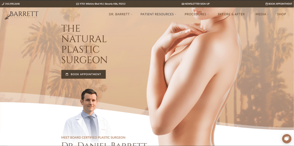
Barrett Plastic Surgery does everything right and more. It defies the standard white-and-blue palette with warm browns, establishing trust, beauty, and brand at the same time. Barrett immediately dispels concerns about “unrealistic” plastic surgery with a catchy header, followed by a clear call to action. The face shot breeds familiarity and establishes credibility right off the bad. Oh, and how could we forget the giant model in the center of the screen? The whole website curves with the photo and really showcases his work. It’s a beautiful plastic surgery website that goes above and beyond what a doctor needs to succeed.
More content you’ll enjoy
- Building effective websites for doctors and surgeons
- Does your healthcare app need FDA approval?
- Five rising trends in web and mobile healthcare apps
- The ultimate guide to creating the best mobile healthcare apps
2) Best Doctor Blog
Doctor Steven Park
Every doctor needs a blog. It establishes credibility and skill, especially if your posts are in-depth. Plus, it will generate more leads and establish a brand.
Dr. Steven Park, a sleep doctor and author, shows how easy it is to have a great medical blog. The website may be pretty standard, but the face photo adds a personal touch. He features several news outlets for social proof, then plugs his virtual coaching, books, videos, podcast, and awards. It’s not just a blog. This website is a social proof powerhouse, and every medical professional should consider a simple, but powerful doctor blog like Park’s.
3) Best Hospital Website
Mayo Clinic
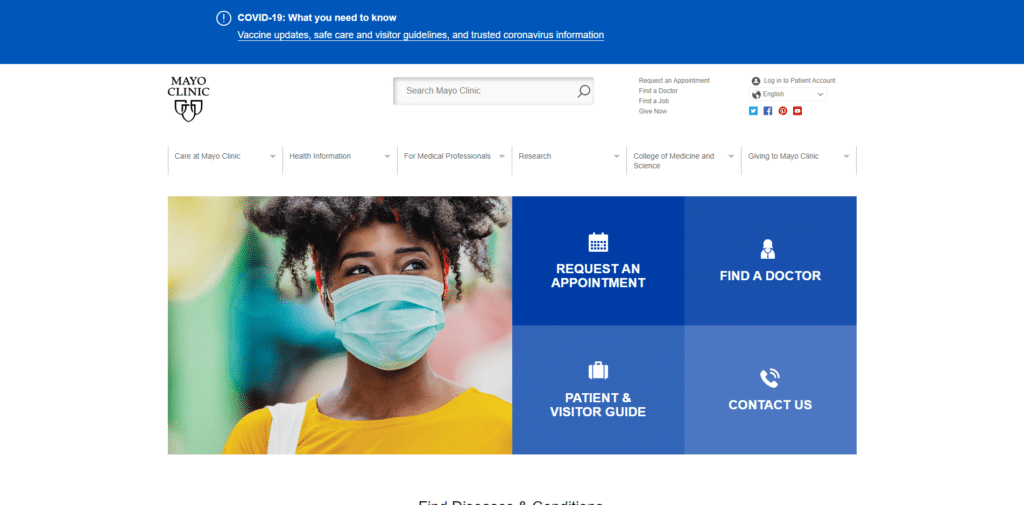
Mayo Clinic defines what a hospital website should look like. It features a lovely face shot (complete with face mask) and four beautifully-designed calls to action. So many above-the-fold calls to action won’t always be a good idea, but it’s brilliant for a hospital website. All sorts of customers, patients, and visitors are opening the websites for vastly different purposes. The landing pabe becomes a hub that directs the traffic where it needs to go, preventing all that information from getting cluttered. ayo Clinic has a standard hospital website, but only because they set the standard.
4) Best Children’s Hospital Website
Phoenix Children’s Hospital
Children’s hospitals need to strike a careful balance between child-like playfulness and cold, medical professionalism. In some cases, those goals contradict. However, Phoenix Children’s Hospital pulls off one of the most well-made children’s hospital websites around. The red-and-blue accents add a warm, inviting playfulness without coming across as too bold or bright, while the scrolling featured images of children and their families establish caring and trust. Phoenix Children’s hospital strikes the doctor/child balance through design that shows they care, making it an awesome healthcare website.
5) Best Neurology Website
Benech Neurosurgery and Spine Specialist
Most experts agree that video is the future of web design, but few execute it as well as Benech Neurosurgery. Upon opening the website, customers are greeted with fast-loading video of neurosurgeons hard at work, establishing skill and engaging the audience before they read a word.
Speaking of words, notice anything about the copy? It’s all in perfect English. This Italian website has built-in translations, which makes it more accessible for global audiences. Plus, human translations are always way better than machine ones. These little extra touches push it far above the rest as one of the most engaging neurology websites around.
6) Best Psychiatric Website
The Nudge Group
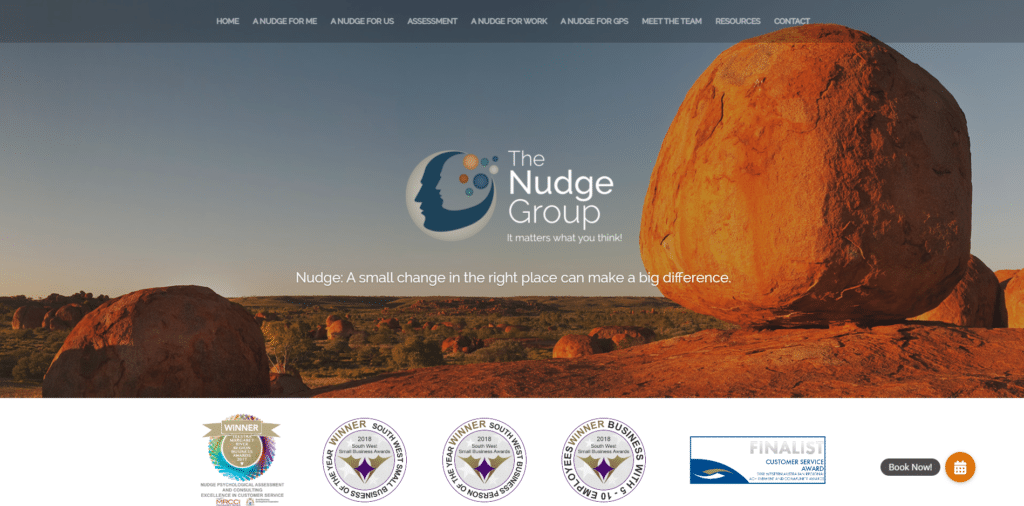
Most psychiatric and counseling websites feel exactly the same, but the Nudge Group bends the norms to create a subtly unique website. Though they maintain the relaxing nature shots and warm color schemes of most counseling websites, The Nudge Group employs lots of creative imagery and downright wonderful copy. The writing turns complex therapeutic concepts into motivating, easy-to-digest tidbits, all focused on a small nudge. The awards, services, and social proof are immaculate. All they need is a call to action above the fold to make this mental healthcare website truly spectacular.
7) Best Dental Website
Deakin Dental
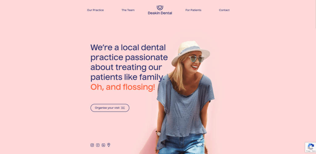
Dentists are scary enough as-is. That’s why this fun, playful dentist website stands out so much. The pink background and overall layout are fun, minimalist, and very inviting. The highlighted text is laid back and on-brand. And if the basic design isn’t enough to establish trust, the smiling woman is. Her delight transfers to the visitor, and her bright-white teeth hammer home that these dentists can make your teeth sparkle. It’s a fun and functional dental website that dispels the fears surrounding dentistry.
8) Best OB-GYN Website
Sunshine State Women’s Care
Most OB-GYN websites are strangely bad. They either dodge possible discomfort through overly-clinical copy or make viewer’s eyes burn like a neon-pink star.
However, Sunshine State Women’s Care strikes the perfect balance between approachable femininity and clinical expertise. The two smiling women add a personal touch and direct the viewer’s gaze to the header and call to action. Meanwhile, the neutral colors pair perfectly with the blues and lavenders. It gets across a feminine and doctor-y vibe at the same time, making it an awesome women’s health website.
9) Best Orthopedic website
Dr. René Heppner
It can be scary to see a doctor for a muscle or bone issue, but Dr. René Heppner’s entire website is specifically built to establish trust at a glance. Even if you don’t speak German (the header translates to “life is moving,” in case you were wondering) the website stands out. The header video shows strong, healthy movement, medical equipment, and warm faces. It makes Heppner feel like a craftsman. Plus, it establishes confidence in movement and its importance. All it needs is a call to action to truly rise to the top. Otherwise, it’s an amazing Orthopedic website.
10) Best Podiatry Website
Integrated Podiatry Clinic
These doctors specialize in feet. In case you didn’t notice, they put two feet right in the middle of their landing page. This minimalist design really stands out amongst most uber-cluttered healthcare websites. The neutral colors are relaxing and the pun eases the visitors. It’s a simple, but well-made podiatry website.
11) Best Veterinary Website
Clinica Dr Mauro
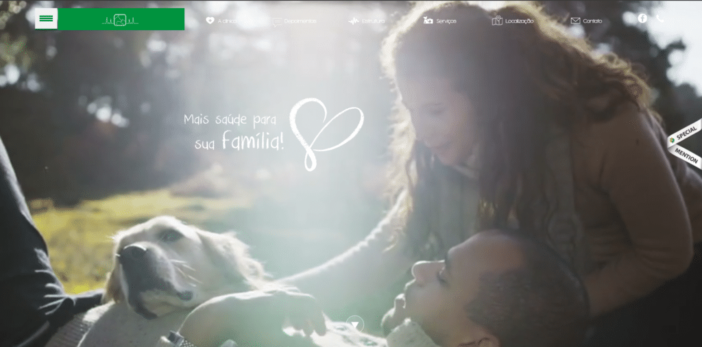
Everyone loves pets. This Brazilian vet website puts a video of a couple playing with their dog in the middle of the site. Then, it carries the emotions of the video throughout the rest of the website with homey design and talk of family. The website establishes familial caring and reminds viewers that pets are family. It’s a truly wonderful veterinary website.
12) Best Wellness Website
Big Sky Health
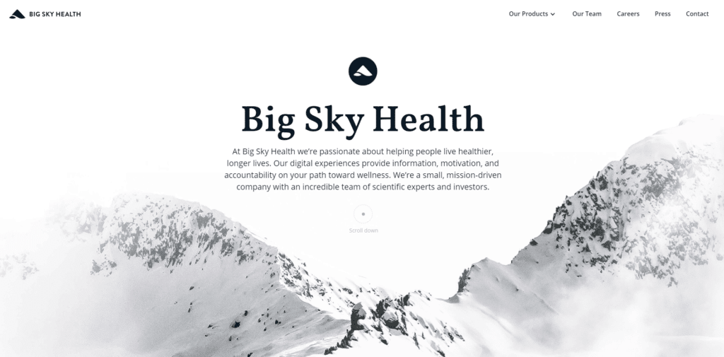
Big SKy Health reminds you how important a healthy lifestyle is in the most soothing way posisble. It leans into natural imagery and motion design with animations, snowy mountains, and amazing parallax design. Scrolling through the website is almost meditative, which is perfect for a website focused so heavily on meditation. It’s truly one of the best wellness websites out there.
13) Best Health Tech Website
Google Cloud Next
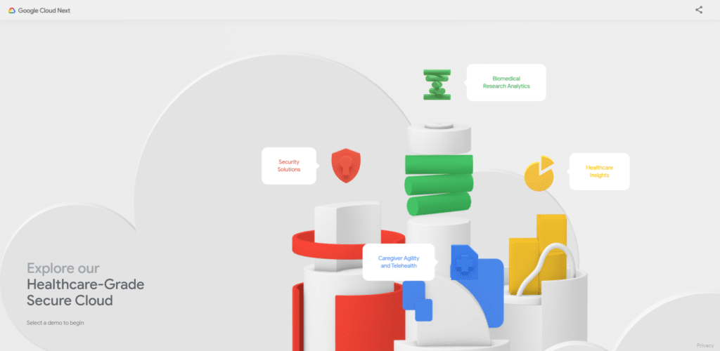
This website is a bit different from the other medical websites on the list. It’s a Google Cloud demo page focused on healthcare-grade solutions. Because it’s more tech-oriented and situated a bit deeper down the sales funnel than most, the design is more google-branded. With neutral greys, 3d-blocks, and a splash of geometric color, this website screams google. Even if you don’t need the tech, this health tech website is super fun to play with.
14) Best Doctor finder Website
Zocdoc
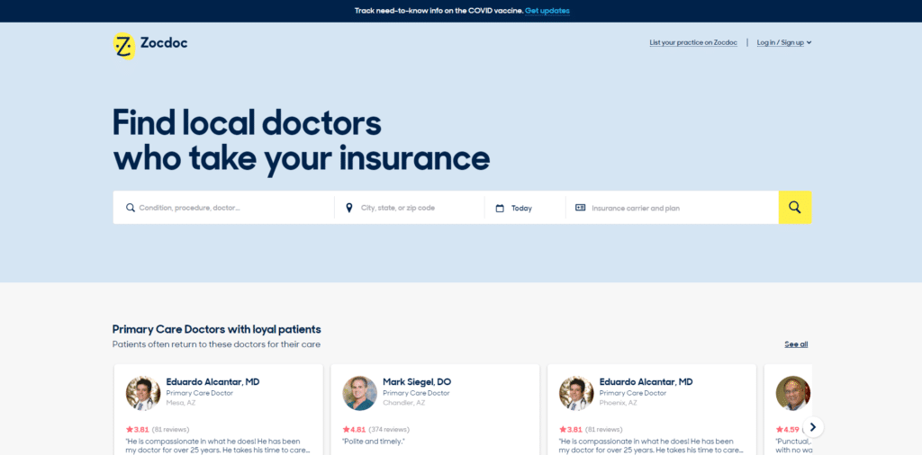
Zocdoc makes finding a doctor simple, so it’s no wonder the website is so simple, too. It opens with a search bar and a massive header. For most, that’s all they need. Everything else is tucked away in an accessible, but not-too-distracting location. It’s a very simple, but effective doctor finder website.
15) Best Telehealth Website
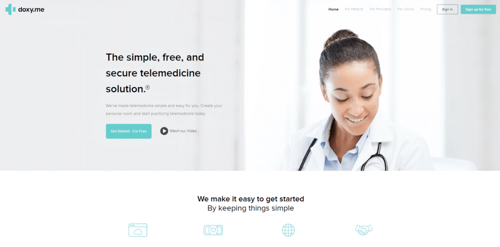
Docy.me
Above all, the COVID-19 pandemic has shown the world the importance of telehealth. Zooming a doctor is much easier (have you read Fyresite’s analysis of telehealth yet?) and it’ll likely grow faster than ever.
Of all the telehealth websites out there, Doxy.me stands out the most. The website is exceedingly simple, which is perfect for “simple, free, and secure telemedicine.” In addition to a call to action, the website also has a large “watch our video” button and a smiling docotr’s face, which significantly improves engagement. In the age of online medicine, this telehealth website sets the stage for many others.
Those fifteen healthcare websites stand out as the best in the business. Does your website stand up to these? If not, fill out the form below for a free consultation.
