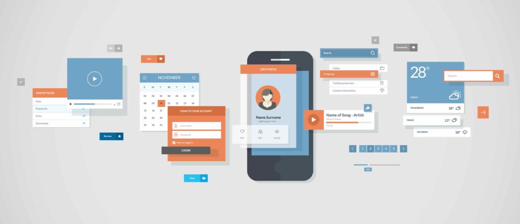
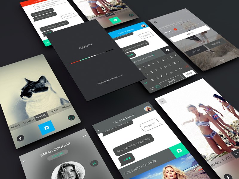
“The more things change, the more they stay the same,” said no mobile app developer ever. In the rapidly-evolving, ever-changing world of mobile app design, you can’t afford to slow down and take ‘er easy (Tony Montana voice). After all, it’s 2018 and mobile apps are the administrators of our lives. But consumer data doesn’t lie—smartphone owners only use about 40% of their downloaded apps. Want to be a mobile app standout? Make user engagement the crux of yourapp design strategyand get on board with this year’s hottest UX/UI design trends.
1. Clutter: UX/UI Kryptonite
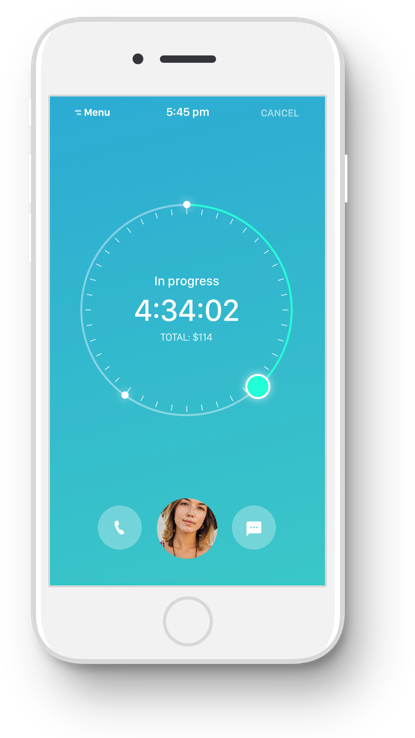
Gone are the days of flash and noise. Instead, clean interfaces and accessible content top the list of 2018 UX/UI design trends. If your current UI is overloaded with elements and littered with layers of needless information, your UX will suffer. This year, tidy up and adopt a minimalistic approach to both design and content presentation. Optimize your UX by carefully curating and communicating a central message that takes center stage. Bolster content comprehension by presenting an orderly set of UI elements that a) highlight key information or b) direct your users to a primary function. Creating a clean visual hierarchy will foster a content-centric mobile app UX, which is on-trend in 2018. Moral of the story? Trash the flash and embrace simplicity in your UX/UI endeavors this year.
Embrace Soft and Muted Color Palettes for Modern Design
Just say no to neon orange. Color contrast, in general, can be an effective UI technique, but 2018 favors soft and muted color schemes when it comes to UX/UI design trends. Supporting this year’s theme of simplicity and sophistication, softer colors yield a more refined and subtle application. Thus, in your UI design process it’s crucial that you adopt a calming palette aligned with the minimalistic aesthetic. Need more reason to keep it cool on the color front? The color scheme you select directly impacts UX as well. From improving navigation to sparking intuitive user interactions, softer colors will achieve balance and increase usability.
Need help finding colors that look good together? A wonderful tool for finding custom color combinations is Canva. The intuitive color wheel page lets you click and drag sliders to create beautiful color palettes in seconds.
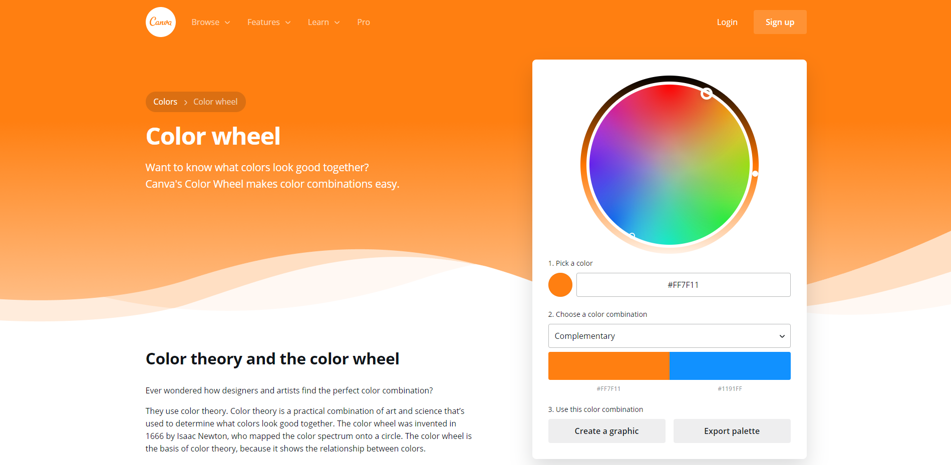
Unlike other color combination tools, Canva doesn’t just tell you what looks good; it also tells you why it looks good. The website is full of useful information about color theory, design, and more.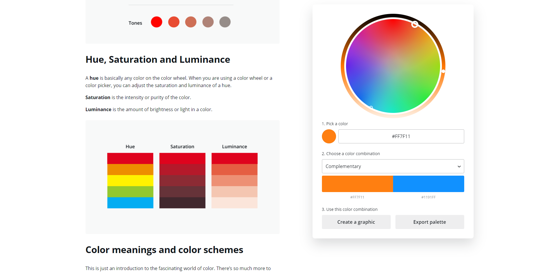
Once you are happy with your color combination, you can export the colors into a PDF and include them in your project. Best of all, it’s free! If you haven’t used Canva yet, go try it out!
3. Size Does Matter
One of the biggest (literally) UX/UI design trends this year is the use of big fonts. From attention-grabbing titles to loud section headings, bold font choices reign supreme in 2018. Weighty typeface and strategic manipulations will bring your content to life and improve readability. Additionally, dominant and memorable font choices will help your app stand out from the crowd. So, when it comes to your mobile app font game this year, go big or go home.
4. Be a Video Vanguard
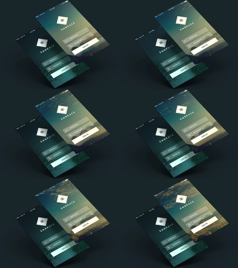
With a breakout performance in 2017, video has cemented its place in the mobile app landscape. For designers and developers, 2018 is about adapting video to meet user needs and tendencies. Sad but true – the average human attention span is now less than nine seconds. With UX in mind, work to incorporate short videos – 30 to 60 seconds – relevant to your app’s content and core messaging. Also, with most smartphone users preferring portrait mode, it’s important to adapt the medium accordingly. Including video not only enhances UX, it also increases engagement and retention. Over 50% of mobile app users view available video content in its entirety and are more likely to access the app regularly. With video here to stay, you can’t afford to buck this/UI design trend.
5. Get Emotional
Machines have feelings, too. One of the more intuitive UX/UI design trends this year is integrating emotional intelligence into the mobile app experience. The way a user feels during his interaction often dictates whether he will use the app in the future. Humanizing UX can be a simple matter of incorporating playful illustrations or warm smiling faces on images, which incite positive emotions. Designing more personalized animation that provides feedback to the user is also effective. For example, a simple green check-mark or thumbs-up animation that results when a user completes a payment or transaction creates a feeling of trust and reassurance. Facial recognition is another technology that’s generating buzz. Apps like Snapchat and Animojiallow users to express a wide range of emotions through facial recognition software. Appealing to–and capturing–user emotion can help you tailor your mobile app content to optimize usability.
https://www.youtube.com/watch?v=degoyMNYN7Q
Slow and steady doesn’t win the race in the mobile app design world. To achieve success, you must exercise forethought and keep pace with ever-advancing UX/UI design trends. Sure, it’s a lot to digest, but keep your finger on the pulse of user needs, andconsult with a professional if you need help bringing your ideas to life.
 Jason Turnquist