Design and psychology may not seem to have a lot in common at first glance, but design relies a great amount on understanding what – and why – certain things are more appealing than others to the eye. One of the “laws” of design that UX designers commonly use is Fitts’s law. So what is it? Fyresite has written this blog to explain this design law and how it’s used.
What is Fitts’s Law?
Fitts’s law (AKA Fitts’ Law) is named after its discoverer, Paul Fitts. In 1954, the psychologist was examining the human motor system and discovered that the time required to move to a target was dependent on the distance, and inversely dependent on the size of the object.
This means that the closer and larger an object is, the quicker people can move to it. It’s important to note that this law applies to rapid, pointed movements (like moving a mouse cursor) and not continuous movements (like sketching).
What Does It Have to Do With UX Design?
When Fitts was researching the human motor system, it wasn’t for UX design. During World War II, he studied airplane-cockpit design. He came to the conclusion that human error is responsible for poor design, not human fallacy. His opinion was that many of the lives lost in planes during the war were because of poor design and not pilot error, like they had been recorded as.
To test this theory, he ran experiments that confirmed that size and distance were the important factors in how fast objects can be moved to.
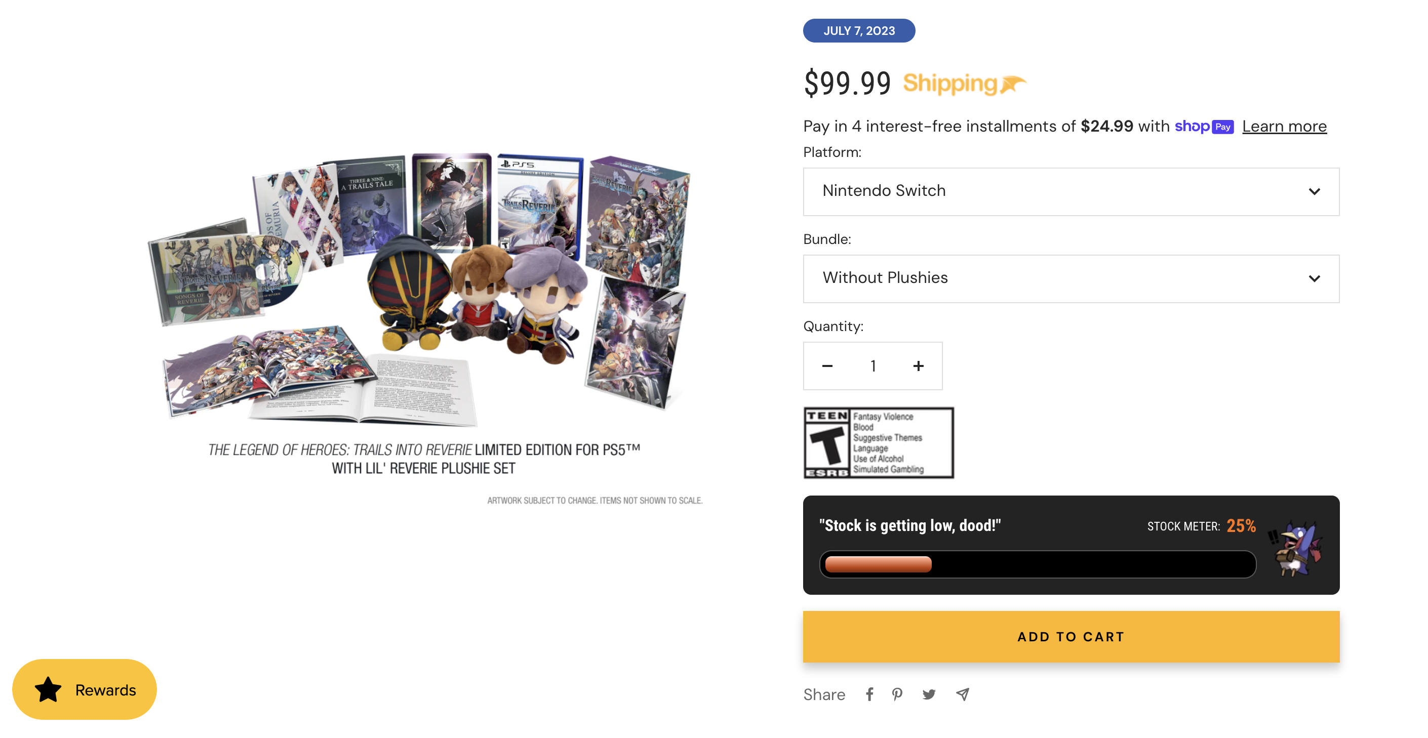
After UX design came around, this law still held up. When making CTA buttons such as add to cart or buy now, designers observe Fitts’s law in action. Whenever there are design elements that they want the customers to interact with, the element needs to be close to the person (in this case, with mouse cursor or finger for touchscreen) and big enough to easily click.

UX Design Applications
Now that we’ve broken down the origin of the law and its relationship to UX design, let’s go over applications of Fitts’s law in UX design.
Sizing
½ of Fitts’s law states that the sizing of elements is important. In simplest terms: the bigger, the better. When the target element is bigger, potential customers will have a much easier time successfully clicking on the element and completing the desired action.
Have you ever had a mobile ad for a game where the x to close out was very tiny? That’s because the desired action is to get you to click on the ad and be redirected to download it, instead of closing out and ignoring it.
Since it’s important to make the target big enough to be easily clicked, it’s also important that the element is not overcrowded. If there are multiple elements too close together, it increases the risk of the wrong element being selected.
Distance
The other ½ of Fitts’s law is about distance. Simply put, the closer the target, the better. Take menus for example. The majority of websites have menus for their potential customers to browse through their offerings. Different menus have different distance options. With a linear menu, the top option is closer to the mouse cursor than the last option. Fitts’s law shows us that the closer options will be quicker, so the further down on the menu you go the less efficient the menu is. One way that designers get around this is to align the menu label to the middle instead of the top, allowing the timing to get to each menu option more evenly.
It’s also important to make sure related targets are close. While it’s still important not to overcrowd the elements, if there are targets that are related to each other (for example, adding search filters and then hitting search), they need to be close. If they’re too far apart, it causes extra time that potential customers may not take.

Looking For the Design of Your Dreams?
Here at Fyresite, our designers are artists and psychologists, making beautiful designs that encourage your potential customers to explore your offerings. To connect with us and start a partnership for your perfect website or app, contact us.