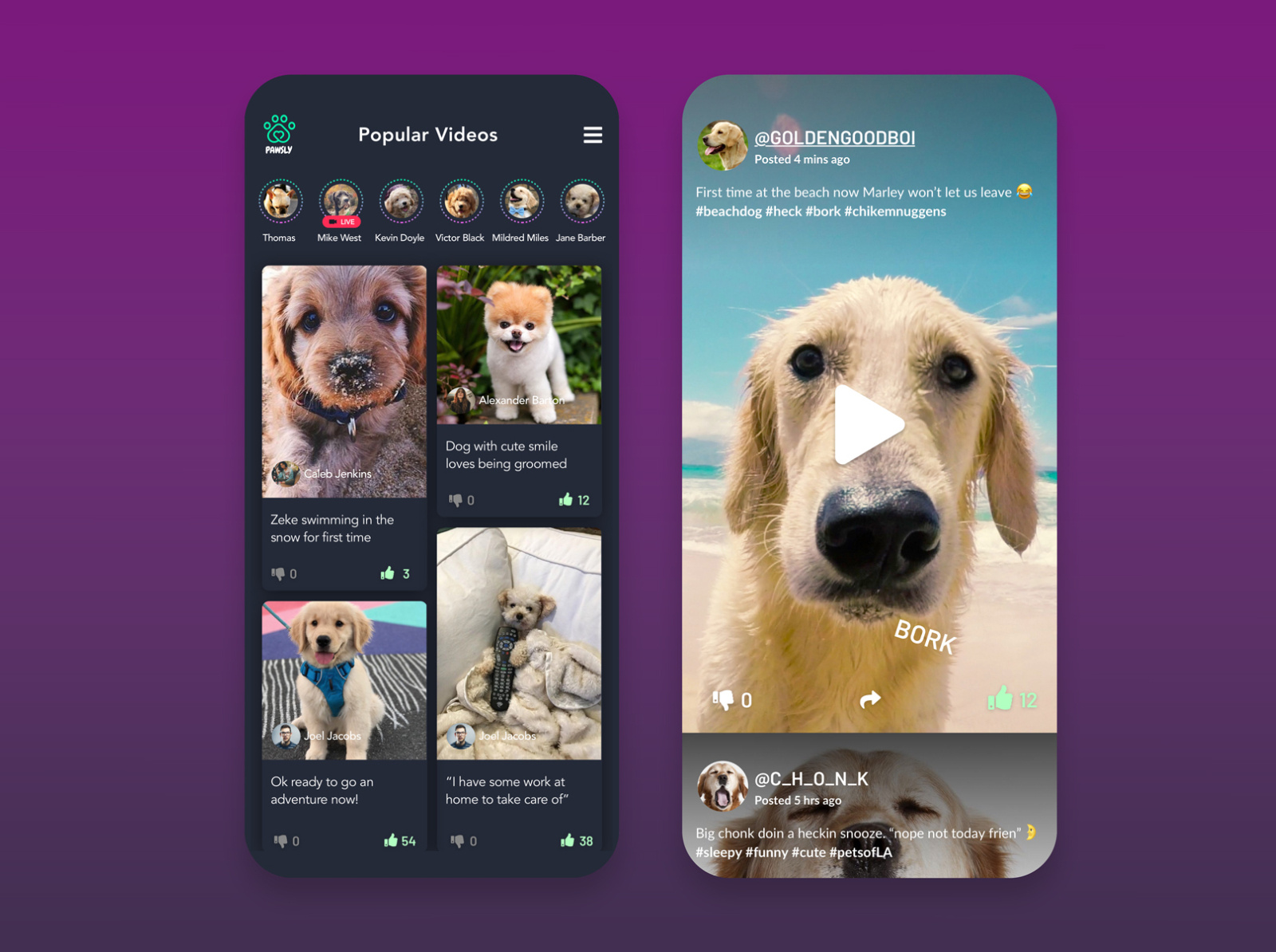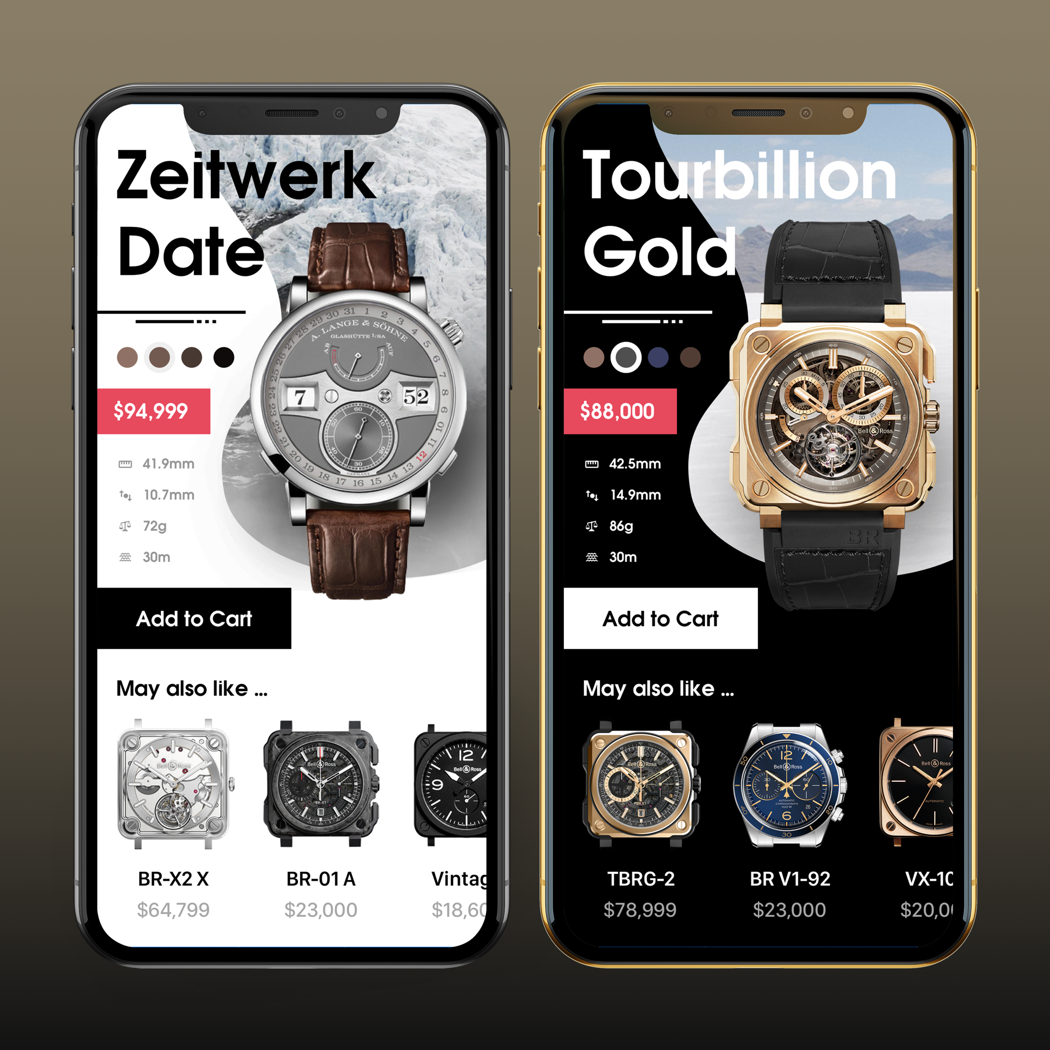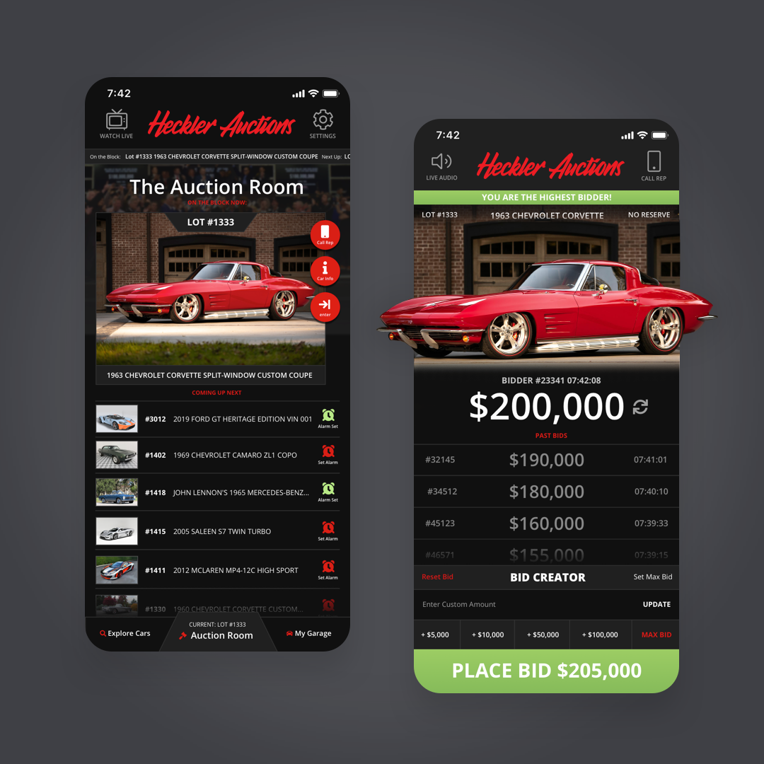
Nothing makes a page pop quite as well as a brilliantly-designed user interface. However, this process isn’t always as easy as it looks. While exceptional UI/UX design remains almost invisible, one tiny hiccup disrupts the flow of the entire application. Whether your app will have several dozen pages or just a few, poor UI/UX design will inevitably throttle your growth. Above all, the user’s experience is absolutely critical to the success of any application. That’s why Fyresite takes the time to design efficient and emotionally-appealing applications the right way. By dividing the design process into four distinct phases, we produce high-quality products on a tight schedule. Here’s a peek at each of the phases in the UI/UX design process.
UI/UX design is an important part of the overall app-building process. To find out what happens before we begin development, read about the spec sheet process. To find out what happens after, read about the development process.

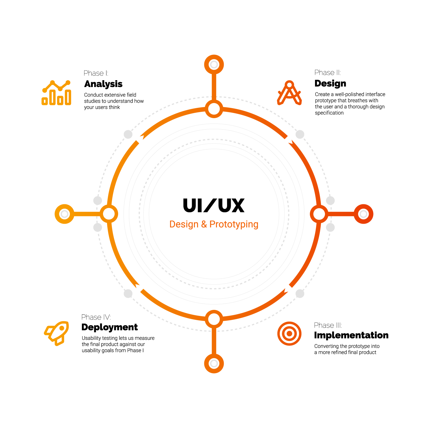
Phase I: Analysis
Fyresite strives to implement the latest and greatest design theory and practices. However, in order to keep up with the times, we must thoroughly analyze the biggest UI/UX trends in your industry. For that reason, we meet directly with you to develop a mutual vision for the project. At this meeting, we discuss your usability goals and preferences. Based on these objectives, we assemble a multidisciplinary team with a wide range of experiences to assure that all problems are approached from different angles.
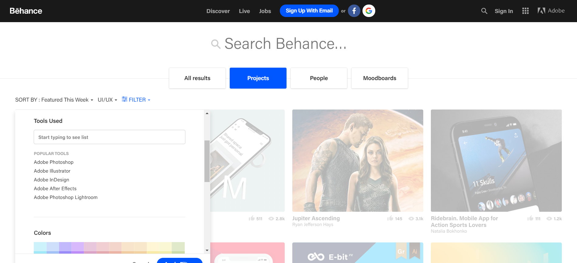
After the meeting, we analyze interface trends in greater depth. Our team begins by looking at competition and similar designs. A great resource for exploring similar UI/UX designs is Behance. Behance is an online platform used for sharing designs and other creative work. Its search function allows you to filter based on project type, design tools, color, and more, making it an extremely useful asset.
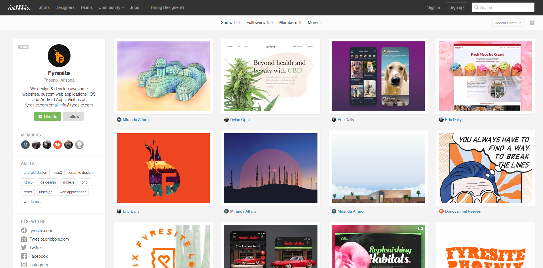
Another website that we use to explore similar design trends is Dribbble. Like Behance, Dribbble is home to unique creative designs, interfaces, and illustrations. Exploring content on Dribbble helps us understand how similar brands implement modern design trends into their applications. Make sure you check out our Dribbble page to see some of our design projects!
After our preliminary design research, we conduct extensive field studies to understand how your users think. Because each user behaves in a unique way, we compile the data into user profiles, which we use to develop a task analysis and to document user scenarios. Without this vital analysis, a user interface is only as good as guesswork.

Phase II: Design
Once we understand how your audience works, we build an intuitive interface around that behavior. To kick off the design phase, the team gets together to brainstorm design concepts and metaphors based on analysis data. Metaphors are especially useful because an app that behaves like a real-world object tends to be more intuitive. As the team designs around user scenarios, a navigation model begins to form. Our designers use this natural emergent behavior to develop flow charts that become a screen flow. The screen flow maps out an average user’s journey through the application and serves as a foundation for walkthroughs and prototypes.
Now that the skeleton is taking shape, we start to add the skin. Designers begin by drawing concepts on paper. As the designs become more concrete, we create elements in Sketch. Then, we expand upon our low-fi wireframes by adding color, copy, and design elements. For this part of the process, our design team uses UXPin. UXPin allows our designers to prototype and simulate applications before the development phase begins. Pages can be organized and nested on a sitemap to the side.
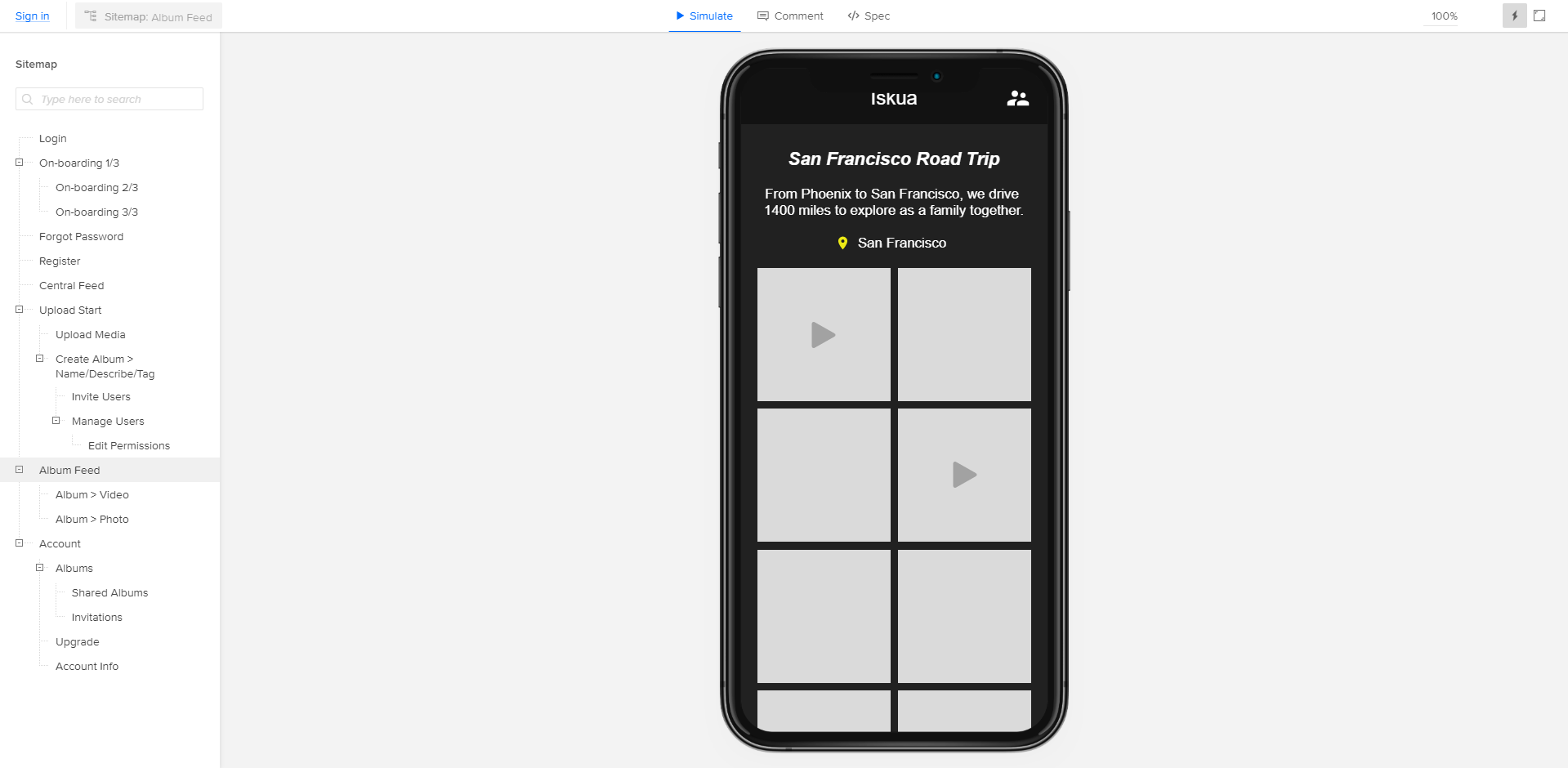
Usability features such as dropdown menus, transitions, and scrolling pages can be tested with ease before any code is written.
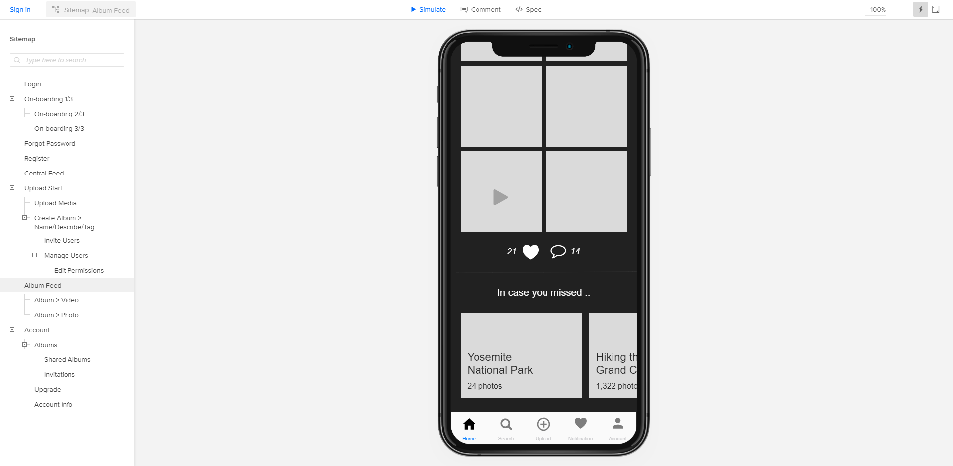
Our team can also edit details such as spacing, color, and font without redesigning entire elements. UXPin enables us to quickly and efficiently refine and test designs without spending too much extra time worrying about code.
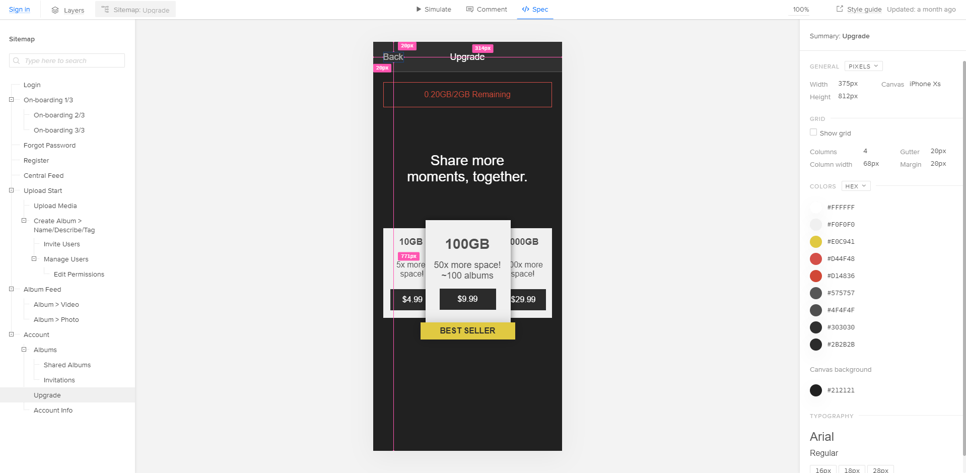
After testing the prototype and identifying areas of improvement, we repeat the process with more detailed designs. The result is a well-polished interface prototype that breathes with the user and a thorough design specification. Because our entire design team works in-house, the interface connects seamlessly to your specifications in the project blueprint.

Phase III: Implementation
During the implementation phase, we begin to convert the prototype into a more refined and sophisticated final product. This part of the process is where your application interface takes on a life of its own. Check out our portfolio for more examples of how rigorous testing results in a refined UI/UX design.
Throughout the process, we conduct ongoing heuristic evaluations. In other words, our UI/UX team works closely with our delivery team to systematically search the interface for usability problems. This close collaboration allows us to seamlessly transition from Phase III to Phase IV with as few hiccups as possible. Once the designs have been implemented, we conduct several usability tests to assure that the product feels as wonderful as it looks.

Phase IV: Deployment
Above all, the user experience needs to focus on the user. As a result, our UI/UX design process ends the same way it begins: with extensive user input. Once our team is fully satisfied with the designs, we use surveys to get feedback directly from the users. Simultaneously, we conduct field studies to collect even more valuable information. With such a wealth of data, our team is able to thoroughly evaluate the usability of the interface. Most importantly, usability testing lets us measure the final product against our usability goals from Phase I.
When the designers, developers, and users are all satisfied by the interface, we move on to the development of the application. Because of the tight collaboration between every member of our in-house team, the UI/UX design process transitions seamlessly into the next phase of app development. To learn how we can improve the design of your product, get in touch through our contact form or call us at 888.221.6509.
